Forty years on West Street. Now just as easy to find online.
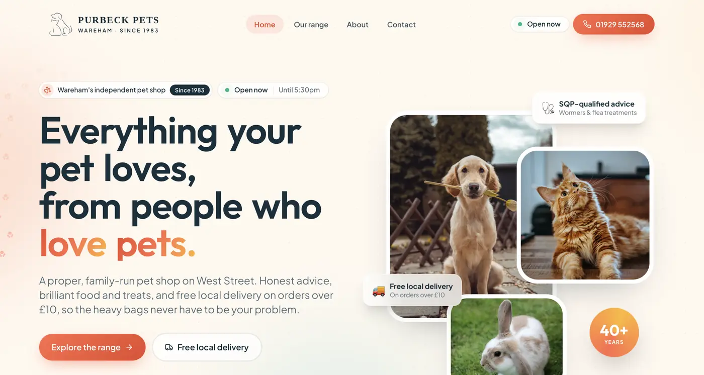
Purbeck Pets has been part of Wareham life since 1983: honest advice, good food, free local delivery and customers known by name. Their old website looked its age and gave none of that away. We gave them a modern site, a brand to build on and an animated shopfront that feels like walking through the door.
The brief
A proper, family-run pet shop with forty years of trust in the town, and a website that felt old-fashioned. There was no colour palette or brand system to work from, and the shop's real strengths, qualified advice and free delivery across the Purbeck villages, were hard to find.
The brief: make it modern without losing the heritage. Warm, trustworthy and useful the moment someone lands on it.
What we did
A brand palette, from scratch
We researched the shop, the town and its customers, then built a full palette for the shop to use everywhere: warm coral and cream for the welcome, a deep heritage teal for trust, and a traditional serif wordmark alongside clean modern type. It feels established rather than trendy.
The shopfront, animated
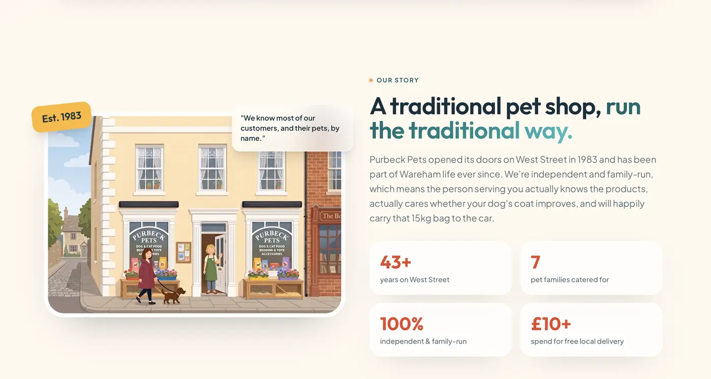
A custom illustration of the West Street shop, drawn from real photographs and references, then brought to life: the door open, the owner waving, a customer walking her dog past the window. It tells the shop's story in a few seconds without a word.
Built around what customers ask
Seven pet families with what's stocked and the brands on the shelf, free local delivery over £10 with a request form, SQP-qualified advice on wormers and flea treatments, and live opening hours in the header.
Found locally, secure by default
Name, address and phone consistent across the site and Google, a page structure that search engines and AI answers can read, and the same security standards we build into our largest platforms.
The palette, built from scratch
Purbeck PetsCream
The ground. Warmer than white, so the page feels like a shop and not a clinic.
Coral
The welcome. It carries the buttons and the calls to action without shouting.
Honey
The appetite. Food, bedding and treats sit on it, and it lifts a long product page.
Teal
The trust. Forty years of qualified advice needs a colour that settles things down.
Ink
The type. A deep blue-green rather than black, so nothing on the page goes cold.
Why it holds up. Ink on cream reads at 13:1, so every line of text clears AA with room to spare, and the deep teal carries text at 7:1. Coral and honey are surface colours: ink sits on them at 4.9:1 and 8:1, and neither is ever asked to carry small type itself.
Two voices in the type
Purbeck PetsA traditional serif for the name. The shop has been on West Street since 1983 and the wordmark should say so before anyone reads a word of copy.
Modern, geometric and open. It does the opposite job to the wordmark: this is the part that has to look like it was built this year.
Quiet and generous at small sizes, which matters on the pages that do the real work: opening hours, delivery areas and advice.
What changed
A website that finally matches the shop: modern, warm and unmistakably Purbeck Pets, with a brand palette the family can carry into everything else they do. It answers the questions people used to ring up with, and it gives Google and AI search a clear picture of an independent pet shop in Wareham.